Designing a Scalable Branding System for the 36th Louie Awards

The Louie Awards, hosted annually by the Greeting Card Association (GCA), celebrate the best in greeting card design, craftsmanship, and innovation. Often called the "Oscars of greeting cards," the event highlights the best in greeting card trends from the industry’s most talented designers.
As the lead designer for both the 35th and 36th Louie Awards, I had the chance to develop a scalable event branding system and then push it forward. The goal was to keep the identity fresh while maintaining a cohesive, recognizable brand identity that could evolve over time.
Building on Last Year’s Brand System
For the 35th Louie Awards, I created a modular event branding system that mixed abstract patterns with postal-inspired details. The idea was to build something bold, flexible, and scalable—a system that worked across digital marketing, print materials, and live event signage. The mix of structured layouts with playful abstraction gave the event a high-energy, contemporary feel while keeping the prestige that comes with winning a Louie.
Last year’s system was well received, especially for its bold use of color, dynamic typography, and adaptable layouts, so when it came time to design this year’s branding, I wanted it to feel like an evolution, not a reinvention.
Last year’s design system
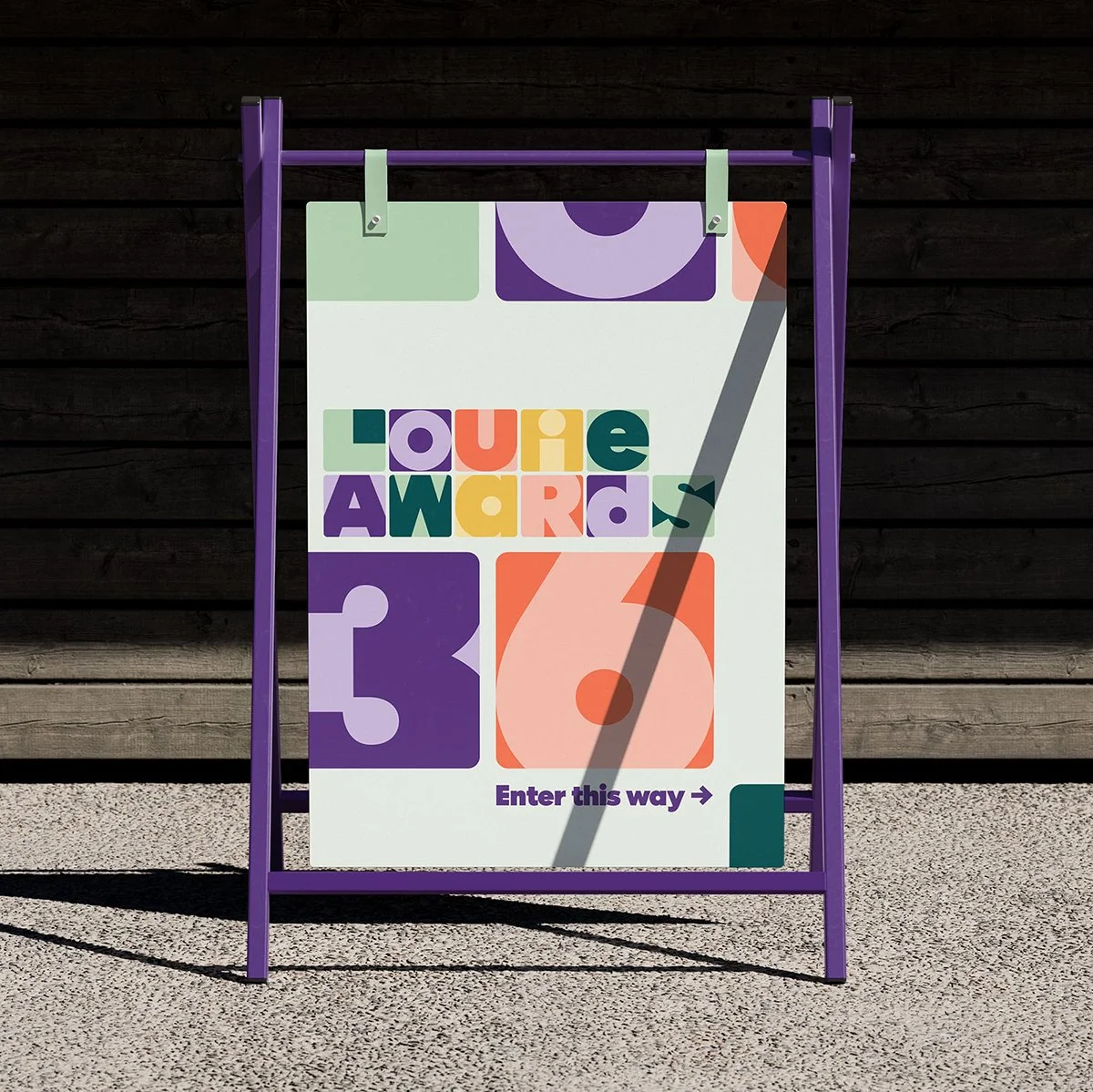
Shifting Focus to Typography as the Visual Language
For the 36th Annual Louie Awards, I built on last year’s foundation but shifted the focus to a typography-driven brand identity. Instead of using abstract shapes and iconography as supporting visuals, I expanded, cropped, and restructured the letterforms themselves to create a bold and flexible branding system.
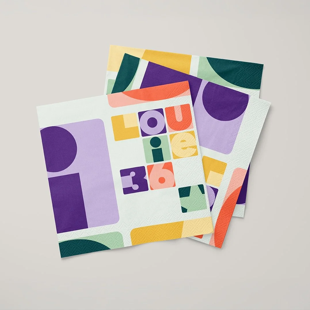
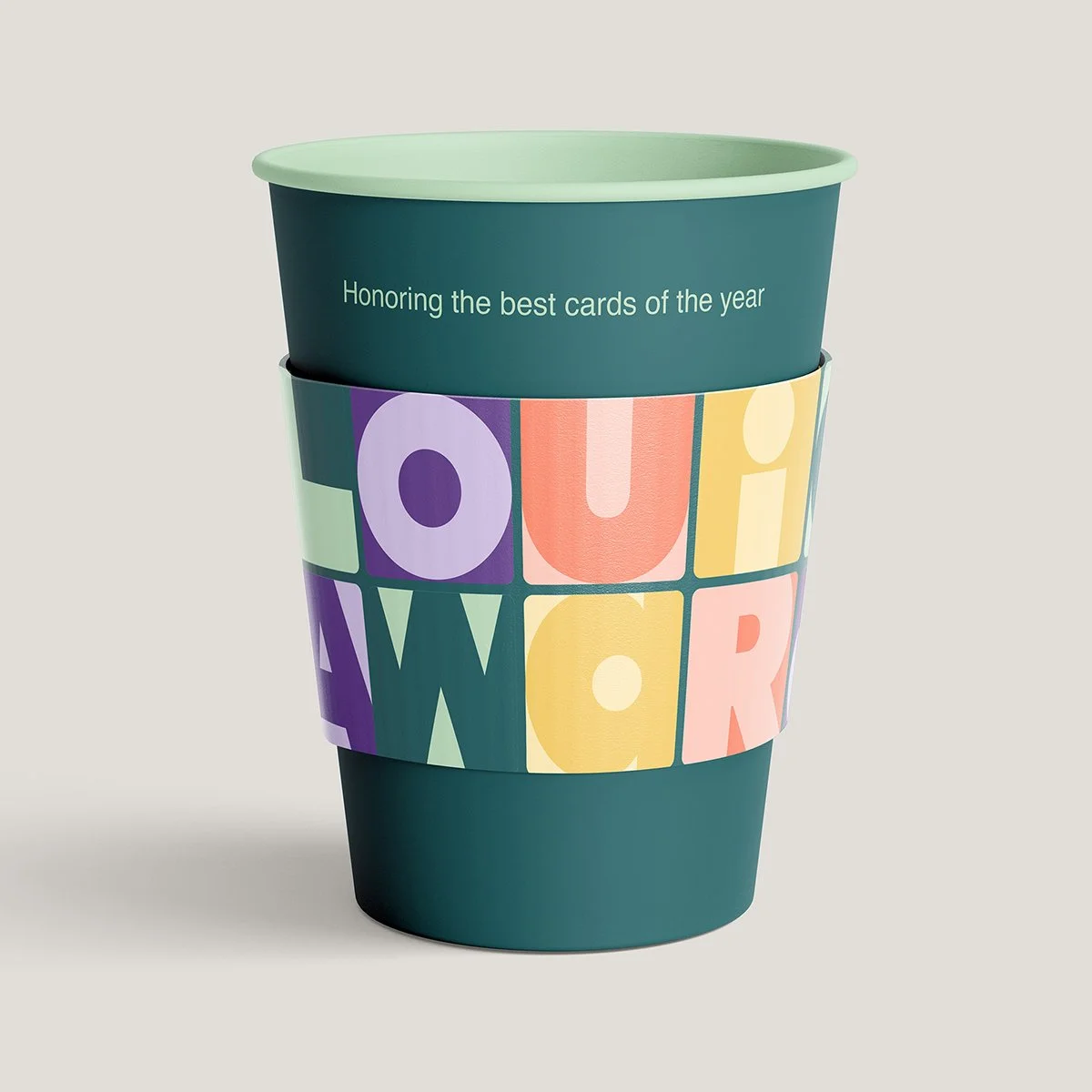
Each letter became a building block, allowing for endless layout possibilities while still keeping the branding recognizable. The challenge was balancing bold graphic design with clear typography, making sure the type felt dynamic without sacrificing readability. The result is a scalable, typography-first event branding system that works across everything from social media graphics and website assets to large-scale signage and printed event materials.

The Role of Color in a Cohesive Brand Identity
While the typography shifted, the color palette remained consistent. The slightly muted yet playful colors introduced last year struck the right balance—vibrant enough to feel celebratory, but refined enough to feel intentional.
Keeping the same palette was a strategic branding decision. Not every element needs to be reinvented every year. Consistent event branding helps build recognition and strengthens identity over time. Keeping the colors allowed the new typography-focused brand direction to stand out while maintaining visual continuity from previous years.


Designing With Intention and Scalability
Working on the Louie Awards committee is a volunteer role, so time was a factor. Juggling this project with running paper&stuff meant making intentional design decisions about where to focus my efforts.
Instead of countless iterations, I focused on design elements that would create the biggest impact across multiple formats. Refining the typographic event branding system while keeping the color palette intact ensured the design felt fresh while still being efficient, scalable, and adaptable across print and digital platforms.
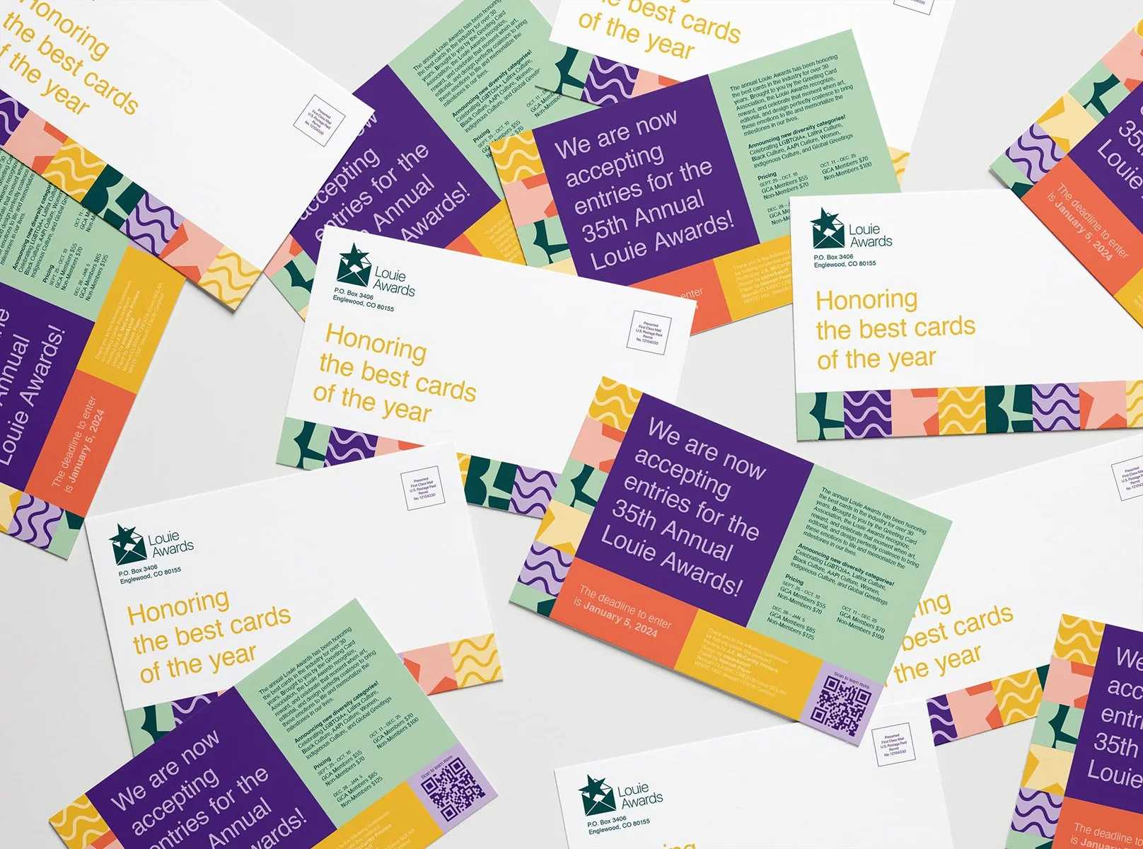
Mockup of the invitation
A Brand System That Grows
The Louie Awards celebrate artistry, craftsmanship, and innovation in greeting card design, and I wanted the branding to reflect those same qualities—bold, dynamic, and adaptable.
A strong event brand identity isn’t always about reinventing the wheel. Sometimes it’s about creating a scalable design system that evolves over time while staying true to its core. As the Louie Awards continue to grow, this system is designed to grow with them, maintaining its role as a recognizable, adaptable celebration of the best in greeting card design.